Back to Work
Case Study
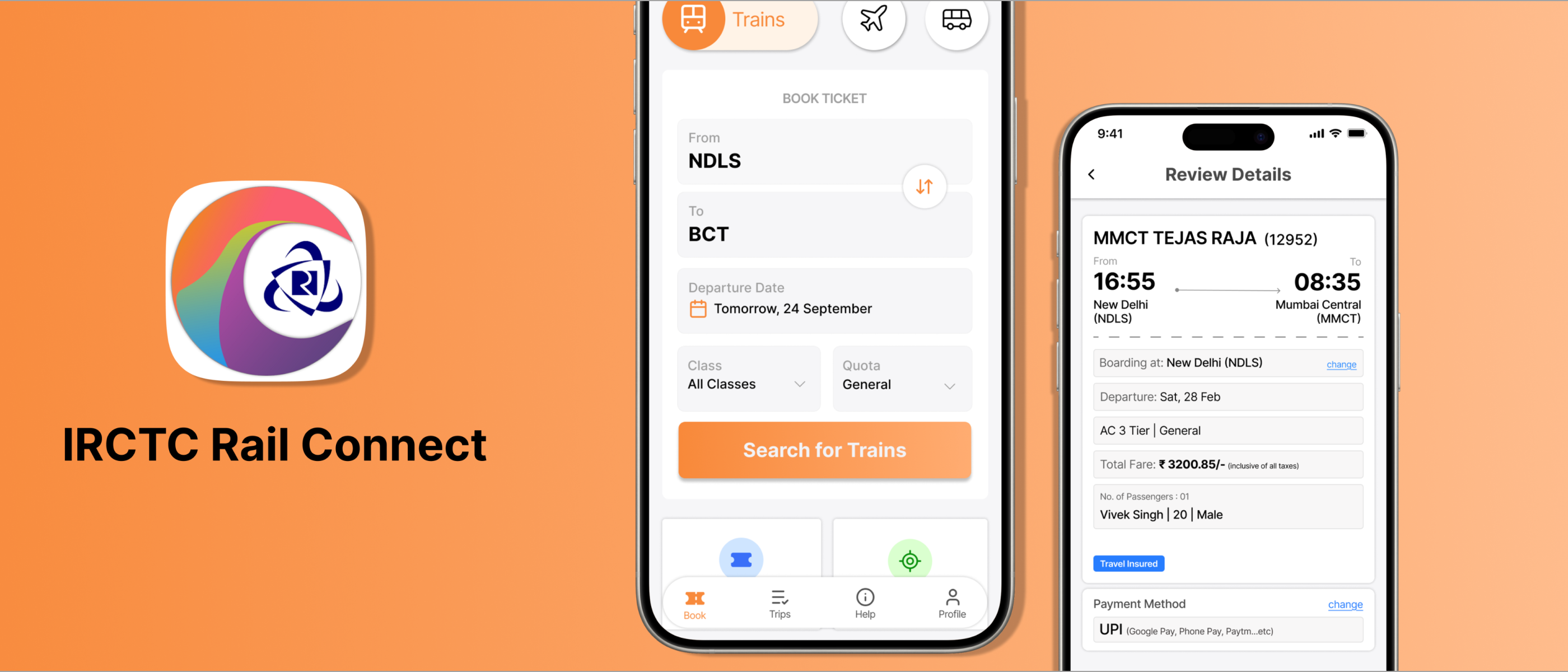
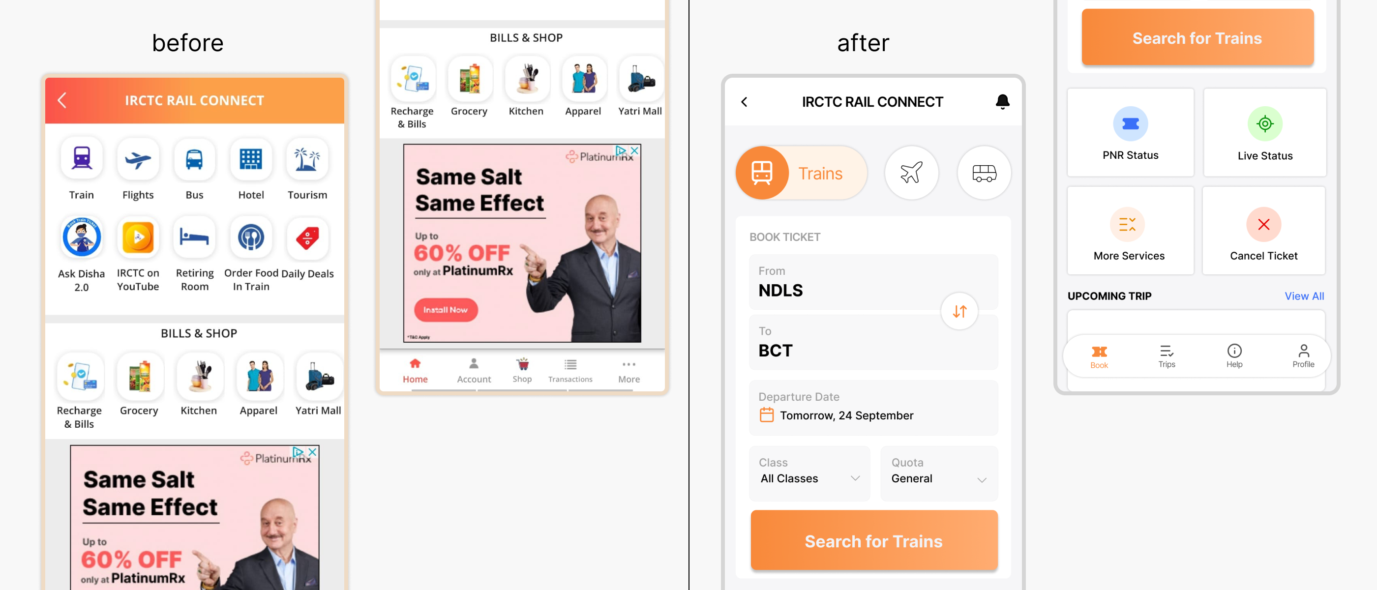
IRCTC Redesign
A UX redesign of India's official train booking app - improving information architecture, booking flow clarity, and reducing payment hesitation.
Project Type
UX / UI Redesign
Platform
Mobile App (Android)
Goal
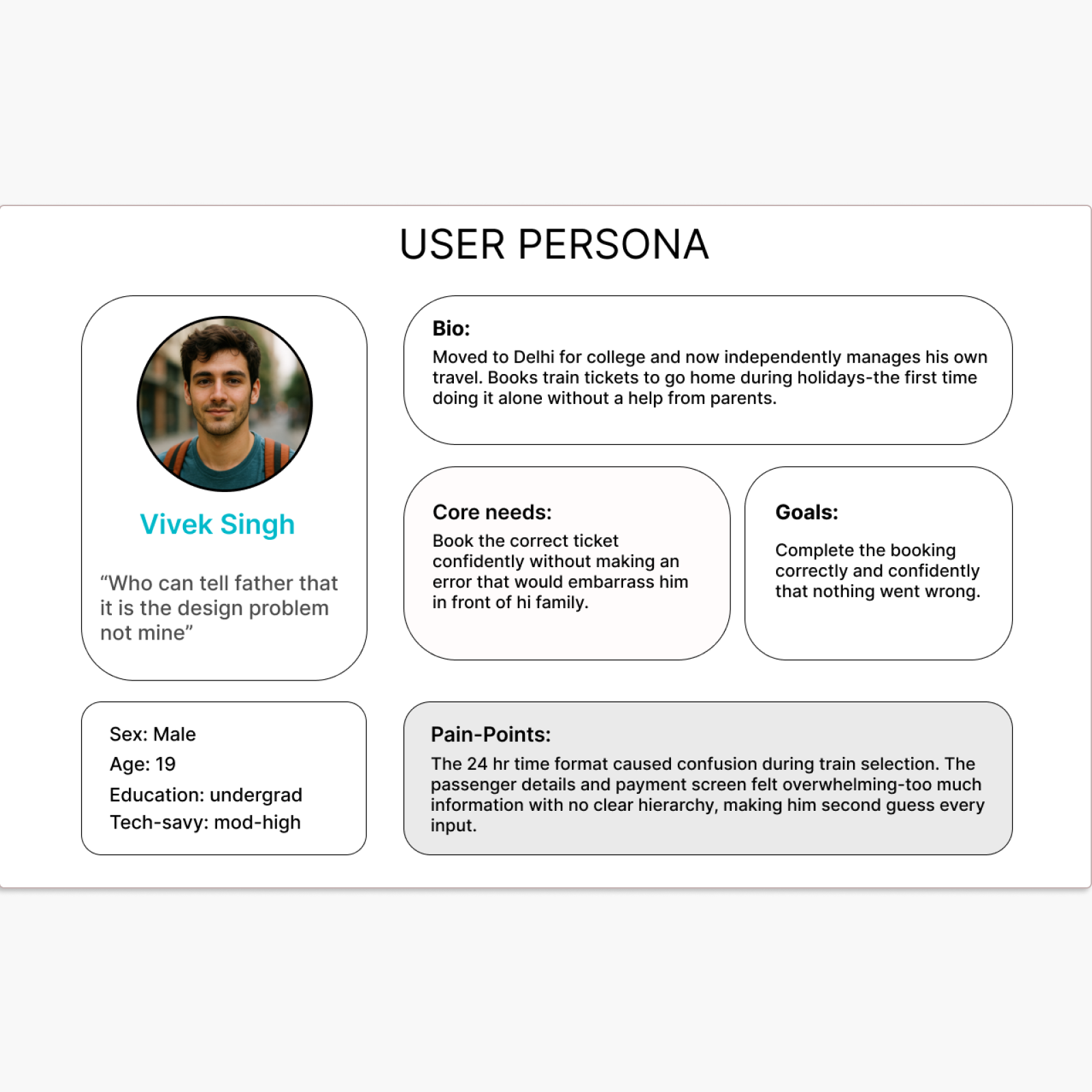
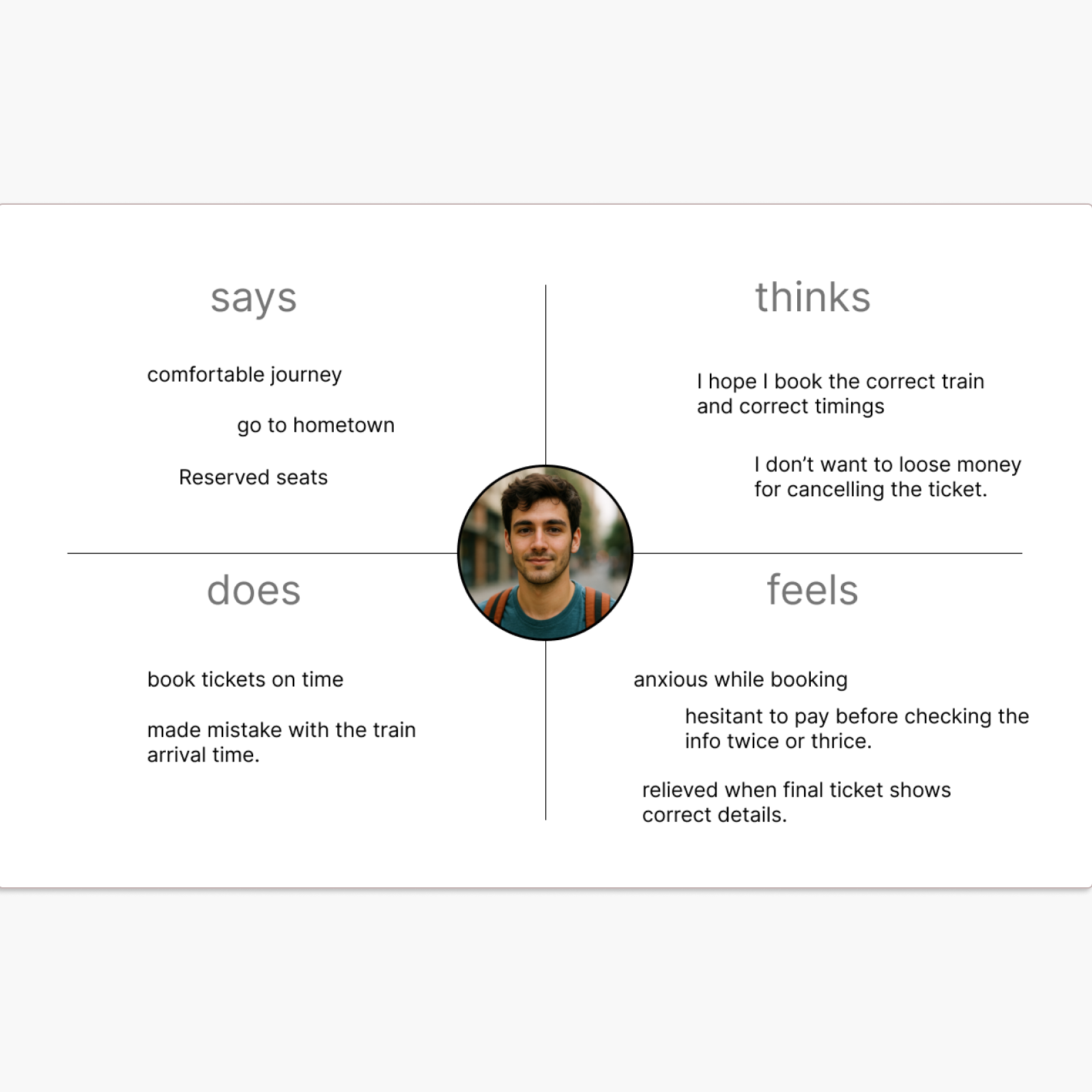
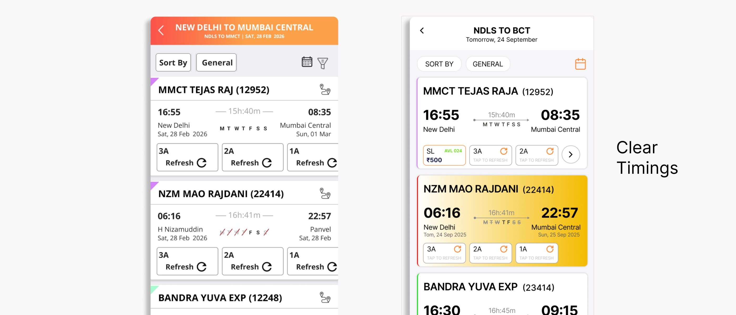
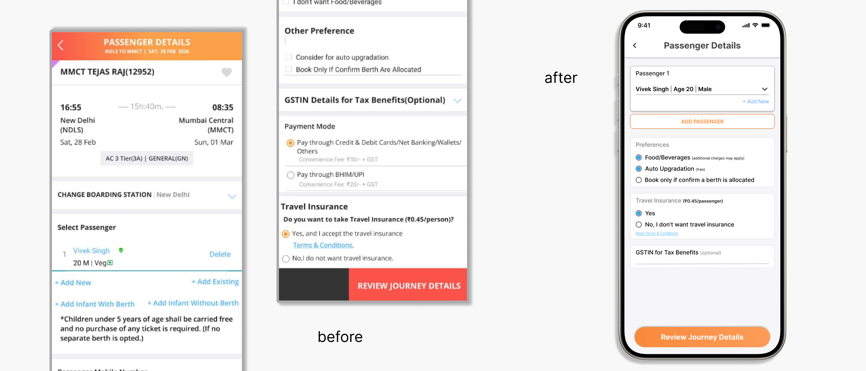
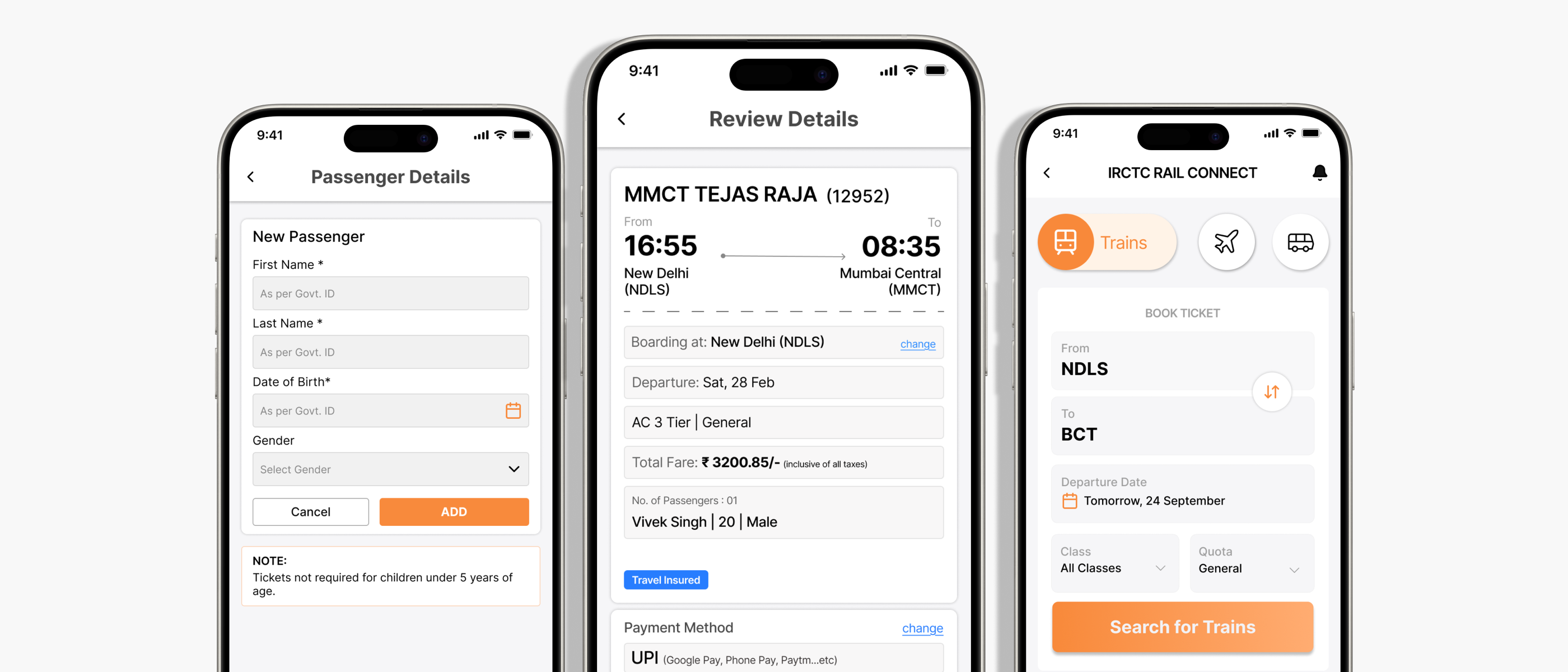
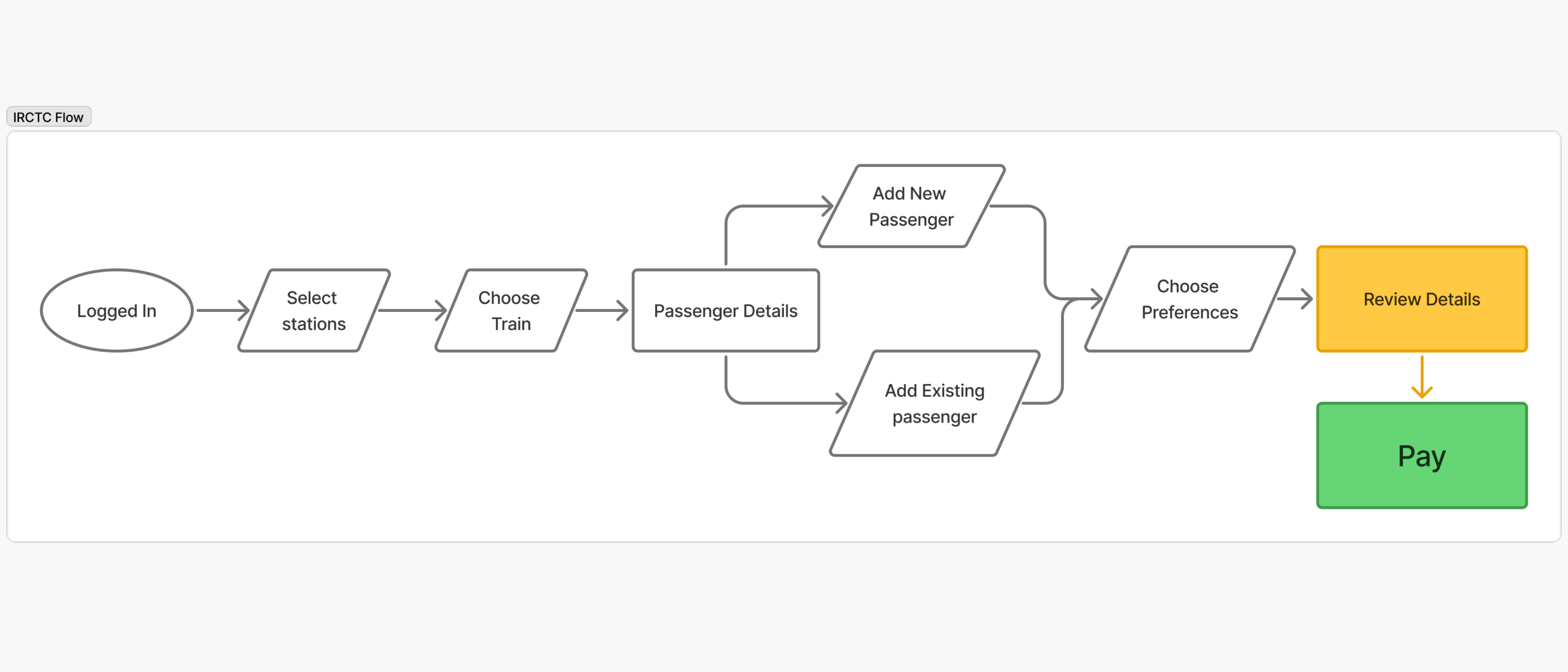
Improve booking flow clarity
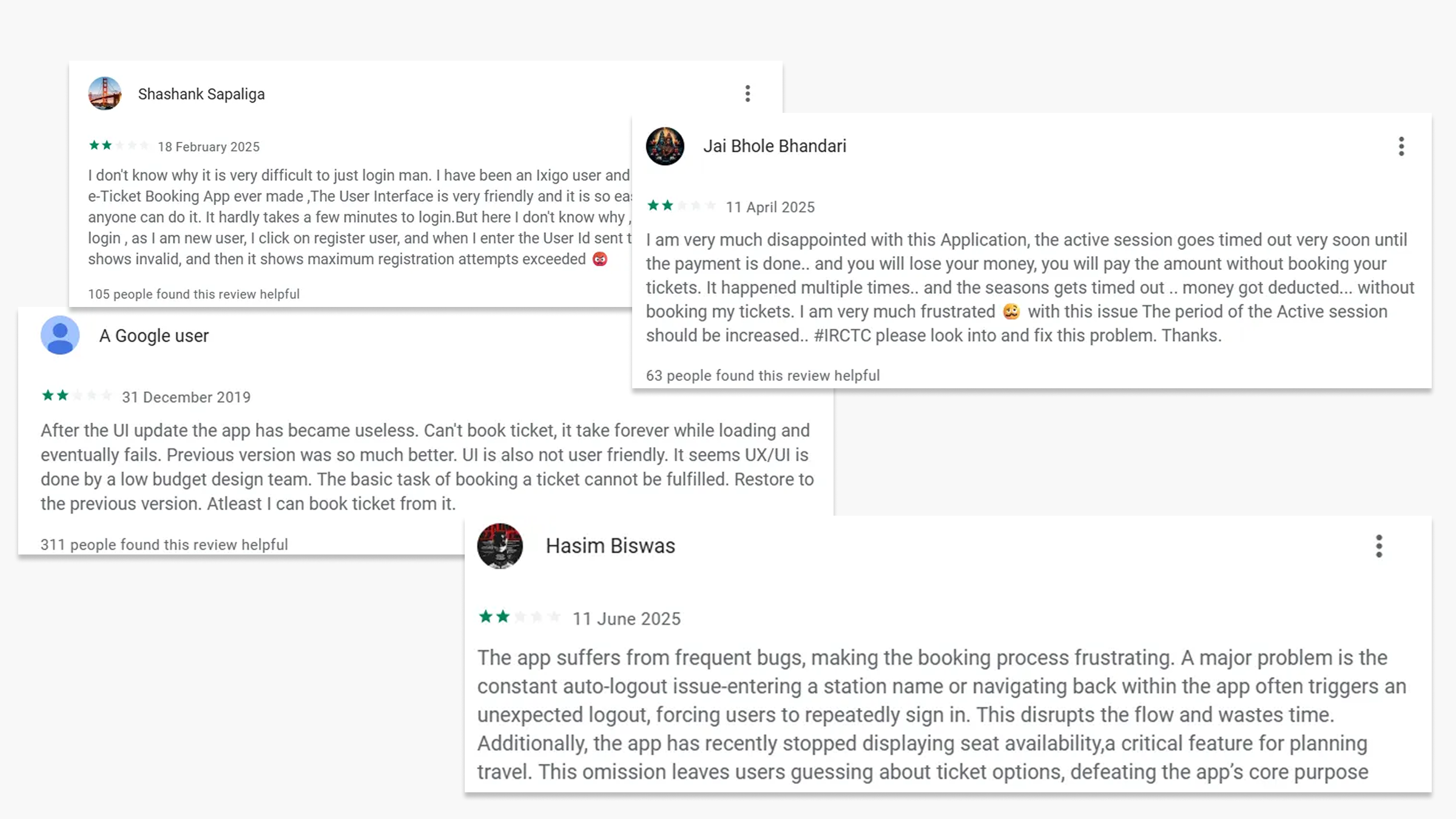
Research
Secondary - Reddit, Quora, Play Store